
Monday 31 December 2012
Mock-up of Advertisement
I really should of done on paper first I know, but here is my mock-up. I really intend on the actual one being way better.

Advertisement Ideas
Planing a mock up for my advertisement has made me look at other examples especially some of the ones I've blogged already. I noticed that most of the ad's of the previous students had a kind of central theme between the album cover and the advert for it. So this has kind of left me stuck on where to start on my advert but then again I looked at Ne-yo's one which had no connection to the album cover it looked quite alright but rushed.
Beyonce- Digipak
I've looked at Beyonce's Album- Dangerously in Love. It was quite simple but it still looked good.
I like the themes of colour she has going on which is white then a really nice blue. I wouldnt mind a background which looked like that but then again I'm wearing blue so it might kinda all just mix in.


I like the themes of colour she has going on which is white then a really nice blue. I wouldnt mind a background which looked like that but then again I'm wearing blue so it might kinda all just mix in.

Background for Digipak
I'm still researching and yet to decide what background I'm going to use for my digipak. Its just too plain and boring! It needs some colour especially because of my artists genre. You wouldn't expect any artist let alone an R'n'B artist to have a white plain background.
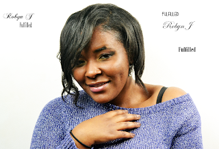
So I've been looking at different things, like sparkles, jewels, Aztec prints basically stuff to do with my artist. She is all about the glitz and glam. Independent Woman, who is now fulfilled. I want to be able to show this to the audience.
Created with flickr slideshow.
So I've been looking at different things, like sparkles, jewels, Aztec prints basically stuff to do with my artist. She is all about the glitz and glam. Independent Woman, who is now fulfilled. I want to be able to show this to the audience.
Saturday 29 December 2012
Digipak mock-up


This is a rough idea of what I want the final product to look like, using the images I took myself. The main difference is that the final one will have more panels, but this was just to see how the colours and fonts that I have already picked will fit together and what image looks best as the background. I liked the contrast between the completely different coloured graffiti in the end.
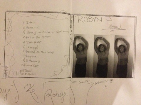
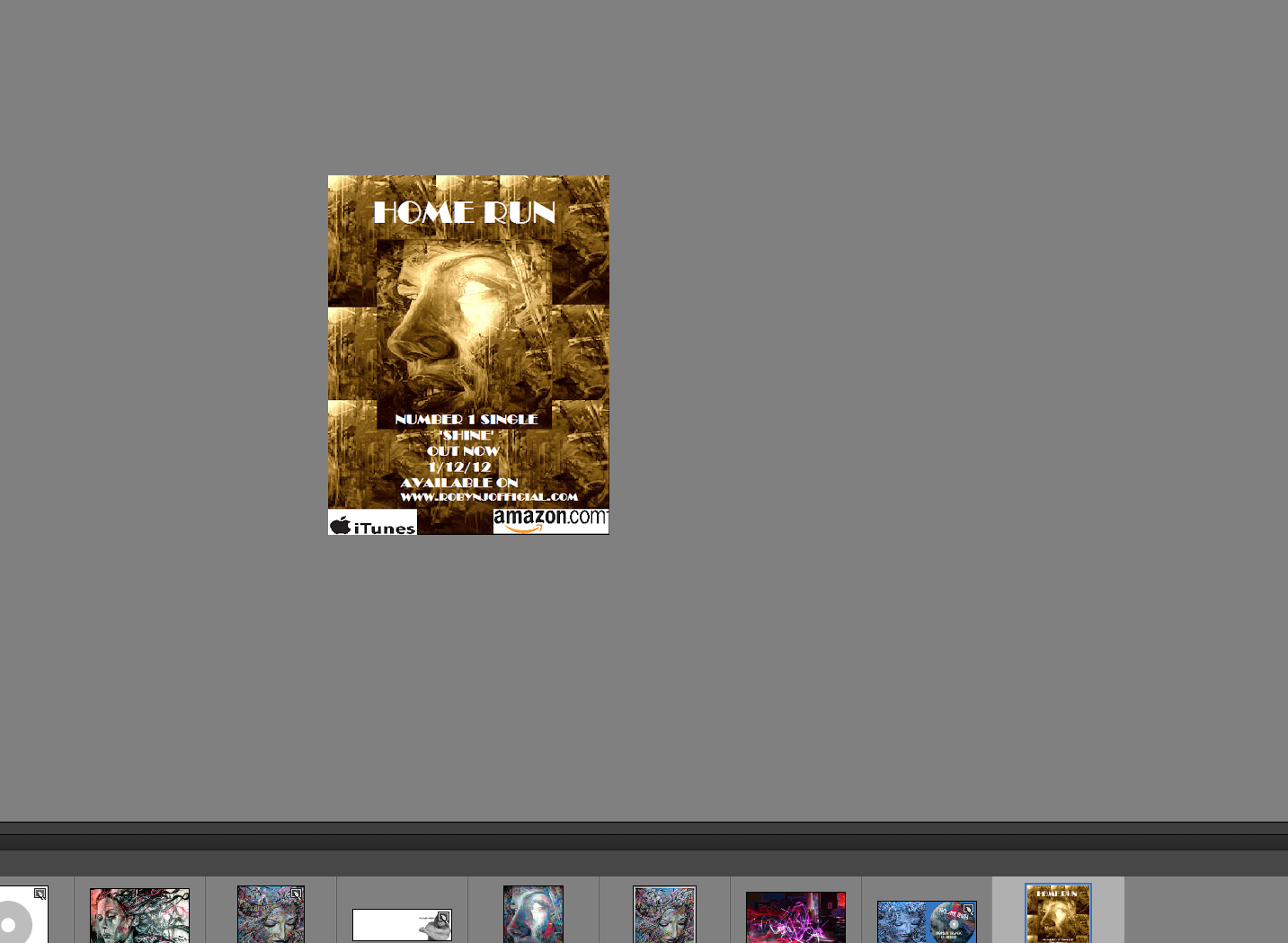
Advertisement mock-up
 I made a rough mock-up of what I planned the advertisement to look like. For the print of the font, I used the same image that I plan to use for the digipak cover so that there would be a recurring theme. I also use the same fonts and include a small image of the Digipak on it.I included well known logos such as amazon and HMV because, after researching the conventions of a music advertisement, I found that these are usually included.
Making the mock-up did make me realise that I need more information or images on it because there is too much white space left.
Font experimentation
Here I was experimenting with the type of font that I wanted to use for the digipak cover. I wanted something bold, that could catch your attention and stand out against a busy background. I also, however, wanted something fairly simplistic so that the emphasis would be more on the graffiti image rather than the title.

Wednesday 26 December 2012
Researching Ideas
Tonight I was just looking at some of Alicia Keys album covers, she is an artist of the same genre as me so this helped. I'm at the stage where I don't know what to have as my background on my actual digipak. I've thought of ways we first decided our artist was portrayed to give me ideas. I looked at our previous mood board but also remembering that whatever I decide has to also suit the image that I have for the album. Looking at Alicia Keys, she has this white background but has made it looked effective as its not all white it blends in with the black I like this.


Another one I like of her's is this close up! It takes up the whole cover.

Thursday 20 December 2012
Digipak images
These are the images that I plan to use for my Digipak. I chose to go to the same place that we did the video to take pictures of graffiti so that there would be a continuous theme throughout the video, digipak and advertisement.

I also experimented with the panaramic settings on the camera so that I could see how the images would fit across the three panels of the digipak.


Album art
I decided that on my digipak cover that I wasn't going to use an image of the artist. Before I did this, I first decided to research if it was fitting for my genre to do this, so I looked at the artwork on my iPod. Our artist, Robyn J, is a neo-soul/urban artist so I picked some out some of the covers (that didn't use the artist's face in the design) that matched a similiar sort of genre.
.PNG)
.PNG)
.PNG)
.PNG)
.PNG)
.PNG)
Wednesday 19 December 2012
Feedback on Mock up- Digipak
After showing my teacher my mock up she gave me her feedback on what she generally thought was good and what could look better also where to a put a few missing informations.
On my front cover, she didn't really feel that I should have the image like that, suggested one would be better off but I explained that the actual image being one was too big and when placing it on the template it looked squashed when I tried to fit it in so she thought that the image I used inside would be way better if it was placed as the front cover and the original one I had outside to be inside the digipak. I liked that idea so I made some changes.
My teacher also noticed that I hadn't included none of the copyright information & catalogue number.
With the inside of my digipak, she thought I could include some acknowledgements since it kind of looked plain.
In my mock up you can see the back cover having some sort of design round it but seeing one person in my group already having something like that I've been trying to think of other stuff that could look just as good to place because right now its looking very detailed but plain.
Another thing my teacher had told us was to make sure our titles could stand out from afar, so selecting the right font would be ideal.
Listening to everything she had said in that lesson I decided to do another digipak but this time all on Photoshop.


As you can see it is looking quite plain :(... I need to change this.
On my front cover, she didn't really feel that I should have the image like that, suggested one would be better off but I explained that the actual image being one was too big and when placing it on the template it looked squashed when I tried to fit it in so she thought that the image I used inside would be way better if it was placed as the front cover and the original one I had outside to be inside the digipak. I liked that idea so I made some changes.
My teacher also noticed that I hadn't included none of the copyright information & catalogue number.
With the inside of my digipak, she thought I could include some acknowledgements since it kind of looked plain.
In my mock up you can see the back cover having some sort of design round it but seeing one person in my group already having something like that I've been trying to think of other stuff that could look just as good to place because right now its looking very detailed but plain.
Another thing my teacher had told us was to make sure our titles could stand out from afar, so selecting the right font would be ideal.
Listening to everything she had said in that lesson I decided to do another digipak but this time all on Photoshop.

And this is the inside.. but I'm planning to keep the same design of the CD on my mock up in the final one.

As you can see it is looking quite plain :(... I need to change this.

Editing Photos
While choosing my images that i was going to use for my digipak I wanted to edit them in order to give it that professional look so I was just testing things about. This was quite fun!


Previous Students Advertisements
Today in lesson I decided to look at previous students ancillary products to help give me and expand on the ideas I already had. This really helped me seeing what they managed to do and how effective some of them were.


I also happened to see Plan B an artist I know of through a magazine in class. This showed me what my advert could look like. This was useful again since there were no ad's of my genre around the places I had looked.

Font Research
Today we researched into the type of font that we are going to use for our album.
First of all we checked on font book the styles that interested the kind of look we was going for and then the ones that stood out to us we tried it on photoshop image.


First of all we checked on font book the styles that interested the kind of look we was going for and then the ones that stood out to us we tried it on photoshop image.


We finally came to a decision that for the artists name 'Robyn J' we are going to use Edwardian Script ITC and then the title of the album 'fulfilled' has not been finalised properly because we cant seem to agree at the moment. So its between 'copasetic' and 'onyx'.
new image ideas for my digipack


Fonts Im looking at ?

I am lookimg at different types of writing that i believe would stick out as something that a digipack with graffiti would have and to try and make it look as realistic as possible have been playing around with all of the ones that stuck out to me
The big differences between a digipack and a cd


Rihanna is one of the worlds most famous female artists and she has made both digipacks and cds. The differences between the two is that for starters a digipack takes it a step further whereas and cd can be for just a single. The digipack has more to it, with the images and sometimes with the leaflets and the details about the song. Digipacks are more attractive and stand out more to the target audience. The reason not many artists of today make digipacks is because they dont have the time or money to be different. Rihanna is different she is know to be a women who takes risks and has a wide audience of young women to women in their late 30's.
A jewel case cd had 3 parts of plastic put together to protect the cd in the case. The digipack has the same packaging generally but info on the cd is printed and pinned to front of the case or on a separate piece of paper. The artwork in the back of the cd can be held securely between the cd and back plastic.
The digipack in my opinion is better because?
It has six sides so it allows more space for the artwork and is easily visible for information and promtions. The artists is more noticed and has better chance of gaining and attracting more people and making their audience grow. The jewel case cd however hasn't got their information as easily accessible and the sleeve of the cd can be easily damaged and removed from the plastic.
Using photoshop


Subscribe to:
Posts (Atom)